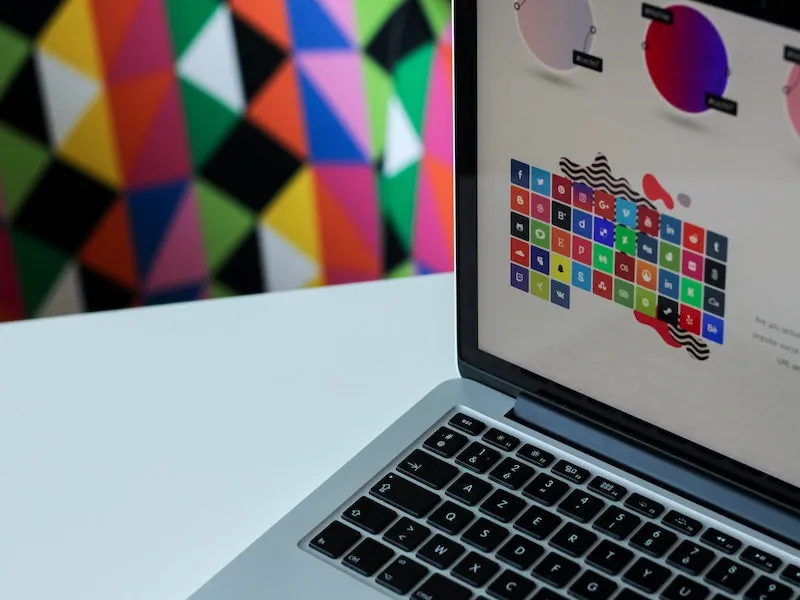
Infographics: The future of presentation

We all know the situation; you just finished your PowerPoint and there are a few slides with large blocks of text no one will read. You’re in need of infographics.
Infographics are visual representations of information or data in the form of pictorials, charts, diagrams or maps. Infographics can help people quickly take in large amounts of information and are more compelling than any block of text.
Like all communication, when creating your infographic, the most important element is your target audience. An infographic for a scientific audience presenting the latest research on aplacophora, polyplacophora, monoplacophora, and gastropoda will be very different from a layperson infographic on different classes of molluscs.
The best way to ensure your infographic is understood is if it follows the narrative and terminology of your presentation. It shouldn’t introduce new concepts and it should be easy to follow. Labelling your infographic with arrows or structuring it with a top-down or left-to-right flow helps your audience read and process the material.
You don’t have to be a world-class visual designer to create your own infographics. Through programs such as Canva or Adobe, you can make your own or employ a professional designer.
A good way to start an infographic is with bullet points that explain what you want to visualise. From here you can then do a rough sketch to build on.
Helpful steps for creating infographics:
- Read your research paper, report or PowerPoint looking for data or information that might work well in a graphical format.
- Decide on your target audience. Consider what they already know about the topic and what’s likely to interest them.
- Write the information you want to portray in the simplest way (dot points are often good).
- Sketch your dot point ideas in different ways until you find one that fits.
- Refine your infographic, considering structure, flow, colours and labels.
- Remember the adage ‘less is more’. Remove unnecessary information. Don’t let ‘creative flair’ detract from the underlying message.
- Use and reuse your infographic. Share it on social media and keep it up your sleeve for other presentations.
If you’d like help creating infographics that really impress, Scientell produces infographics, provides professional advice and runs informative workshops. Find out how we can best support you through our range of services or get in touch.
Author:
Date Posted:
April 11, 2023
